
About Ferfresh
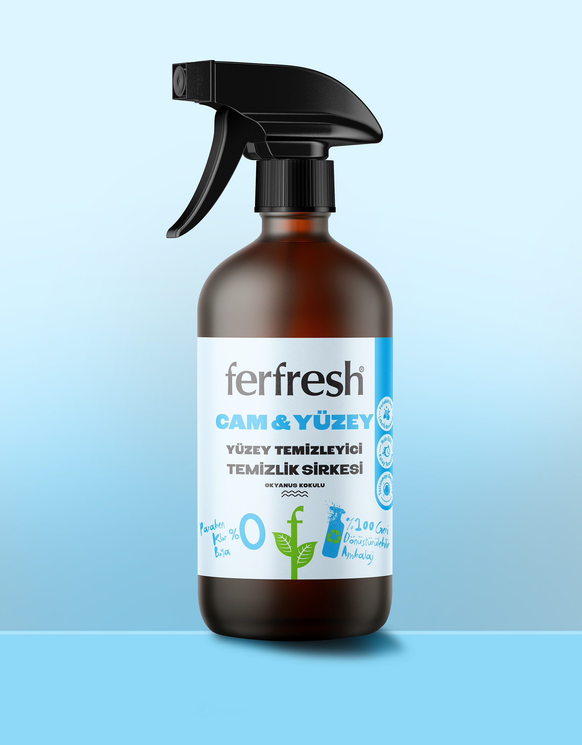
Ferfresh is an innovative brand that combines natural ingredients with effective cleaning performance. By using white vinegar–based cleaning formulas, it provides household hygiene with an environmentally conscious approach. Harnessing the natural disinfectant properties of white vinegar, Ferfresh products deliver powerful cleaning results without leaving chemical residues. This plant-based formula performs effectively on kitchen, bathroom, and glass surfaces while offering a healthy and safe cleaning experience at home.
The brand’s goal is not only to provide cleanliness but also to build a natural, simple, and trustworthy lifestyle language.
Design Approach
During the brand’s launch period, communication channels were limited. The retail shelf became the primary point of contact with consumers. The first packaging design was therefore built on a simple idea: “Let the product tell its own story on the shelf.”
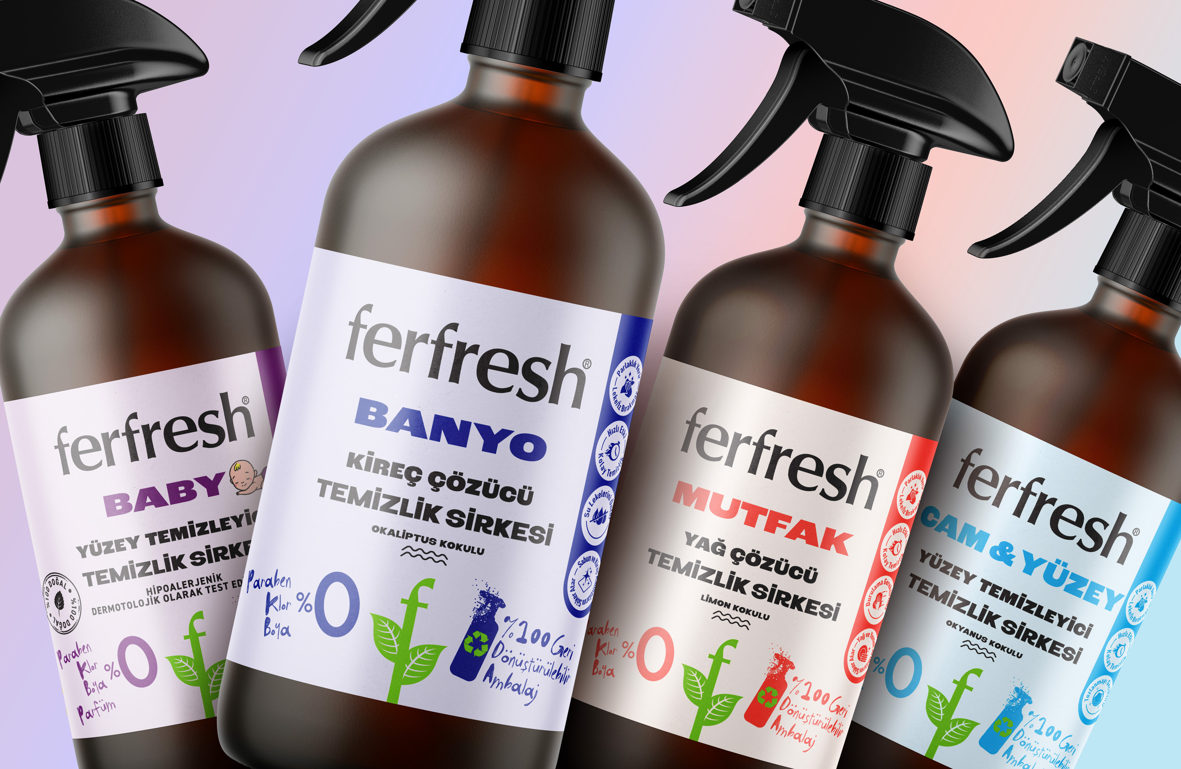
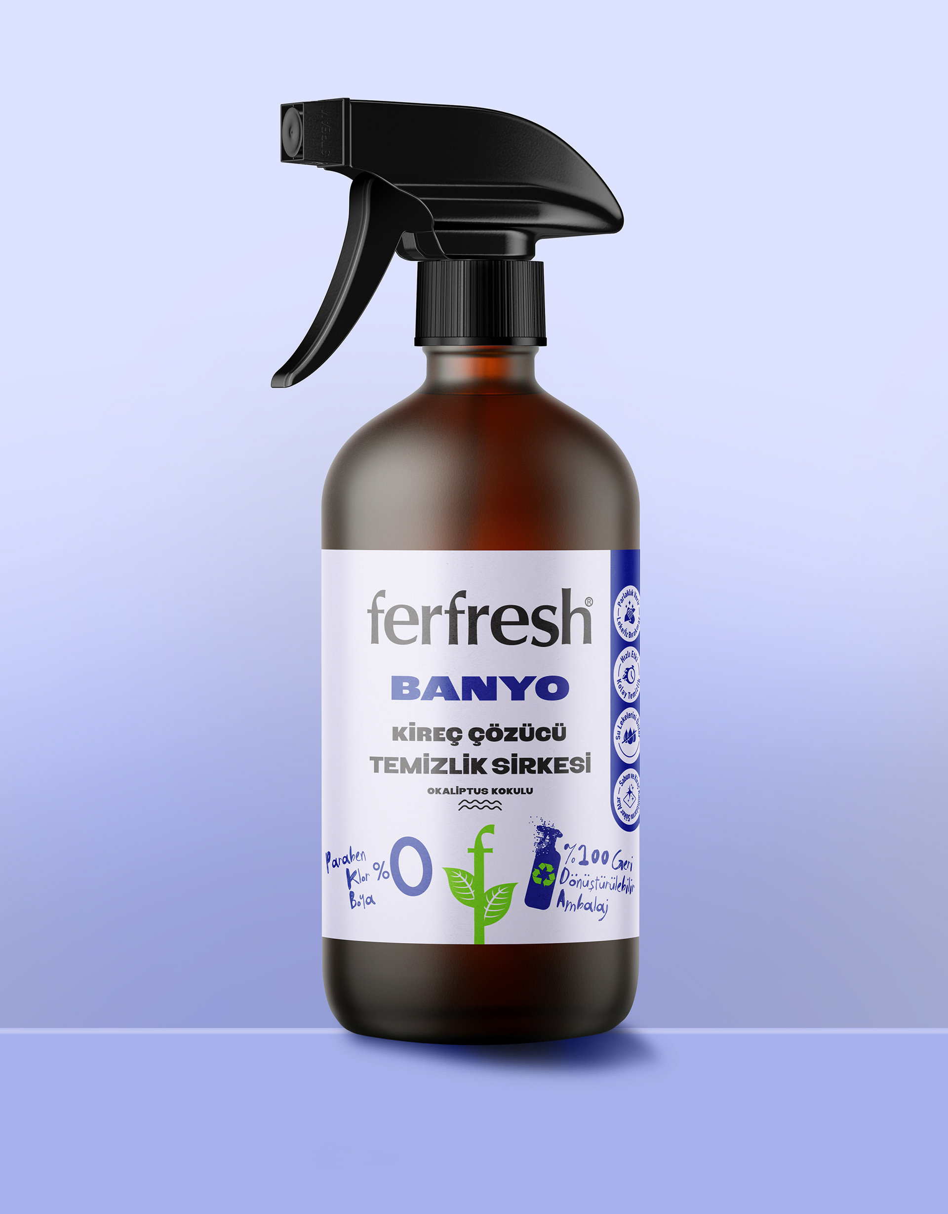
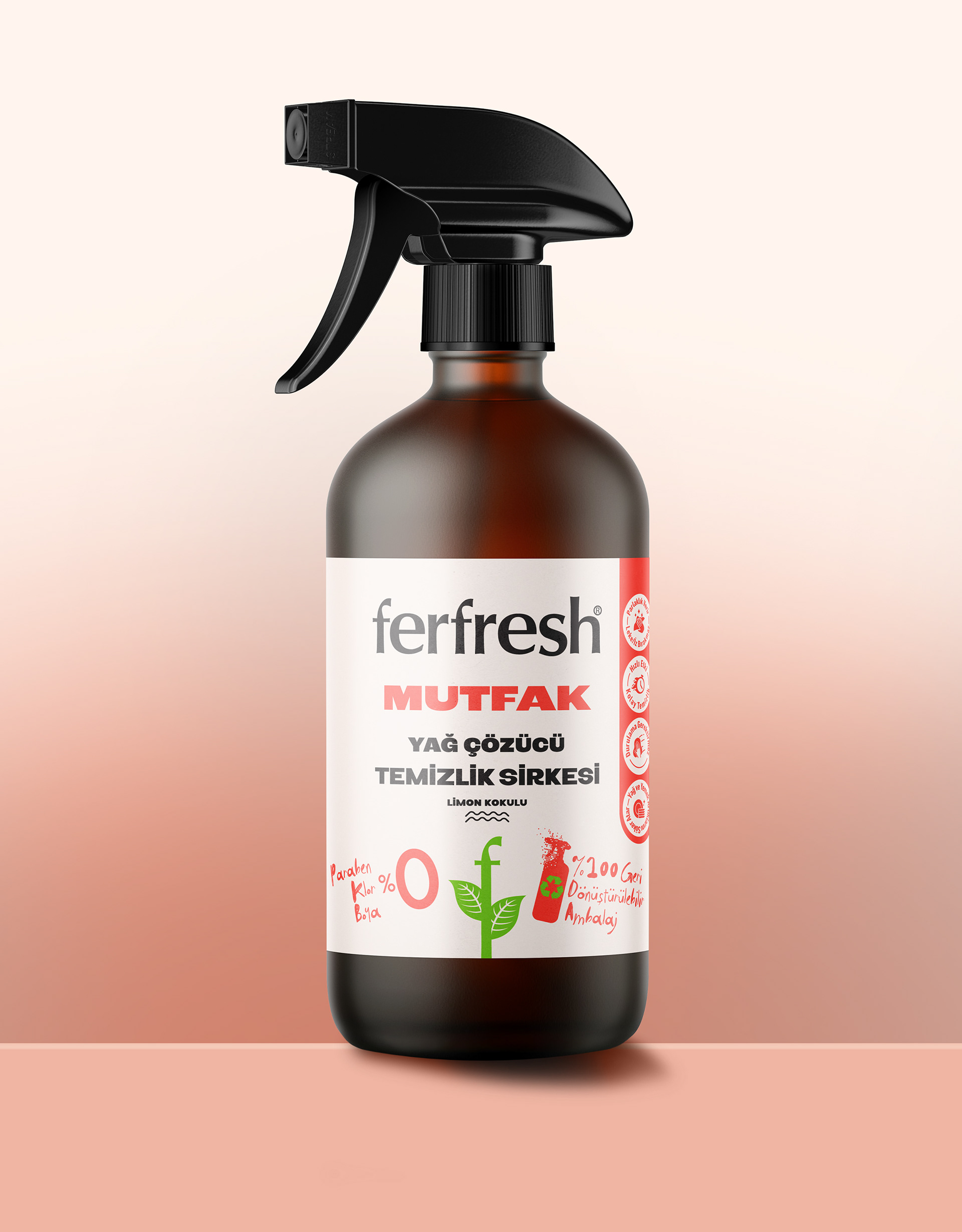
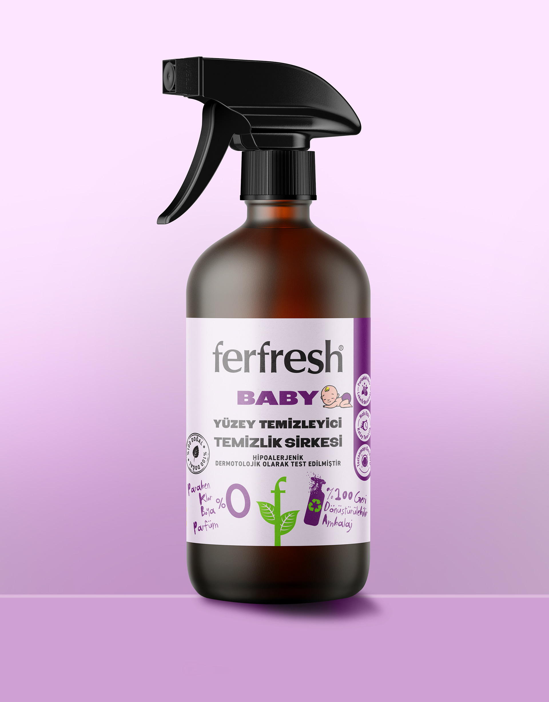
The main objective was to create packaging that acted as a visual sales representative. Ferfresh needed to inspire trust at first glance. To achieve this, the label was designed with a clear and informative communication structure that reflected the brand’s core values — a 100% natural formula, free from parabens, chlorine, dyes, and perfumes, hypoallergenic and dermatologically tested, and packaged in 100% recyclable bottles made with plant-based ingredients such as lemon and eucalyptus.
The label was conceived not merely as a visual surface but also as an informational space. Icons, handwritten details, and a soft pastel color palette conveyed a sense of sincerity, warmth, and reliability. Each product category was defined through its own functional color system. This created a brand language that was both cohesive and functionally distinct across the range
Feedback Process
With this approach, the product family introduced ferfresh to the market with a strong, recognizable identity. However, as the brand evolved, its next goal was to simplify this character and reach a broader audience.The new strategy shifted toward a calmer, more minimal, and corporate visual direction. In line with this evolution, the first design gradually gave way to a different approach.
Today, this packaging design is completing its shelf life. The process revealed how design can serve as a powerful communication tool in brand building, laying the foundation for the brand’s future visual direction, and how strategic simplification can reshape a brand’s position and storytelling language.
---------
Packaging Design
Packaging Print Consulting
Graphic Design
Packaging design by Cihan Camlica
Date: 2024 | Client: Fersan