
Teekanne
About Teekanne
Teekanne, founded in 1882, is one of the world’s top five tea brands and the leading herbal tea producer in Europe. With over 140 years of heritage, the brand has shaped tea culture while representing quality and trust on a global scale. Based in Germany, Teekanne today reaches millions of consumers around the world. Its commitment to sustainable farming practices and the use of FSC and Rainforest Alliance–certified packaging makes Teekanne not only a tea producer but also a responsible brand that cares for nature.
Strategy-Driven Design
The goal of Teekanne’s adaptation to the Turkish market was not only to localize packaging, but also to preserve the brand’s global values while building a strong emotional connection with local consumers. To achieve this, the brand strategy and communication language were carefully redefined.
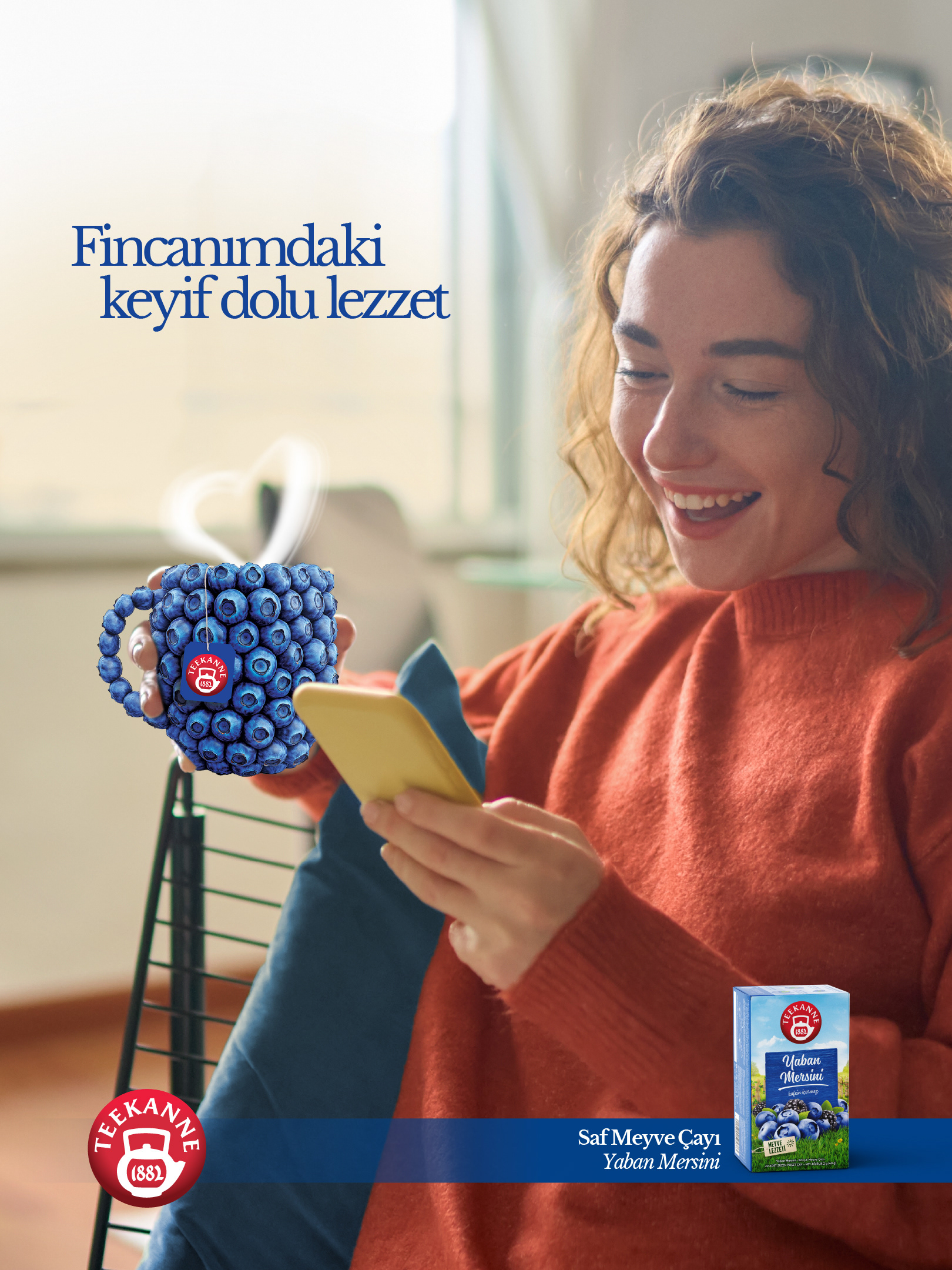
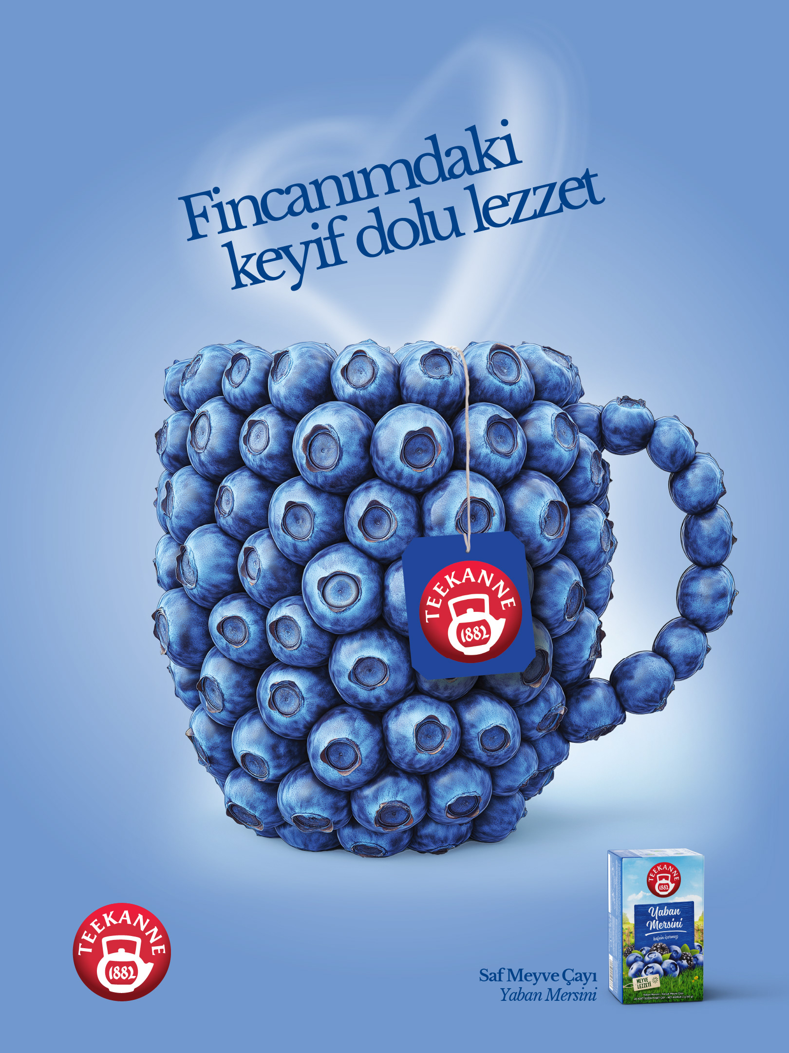
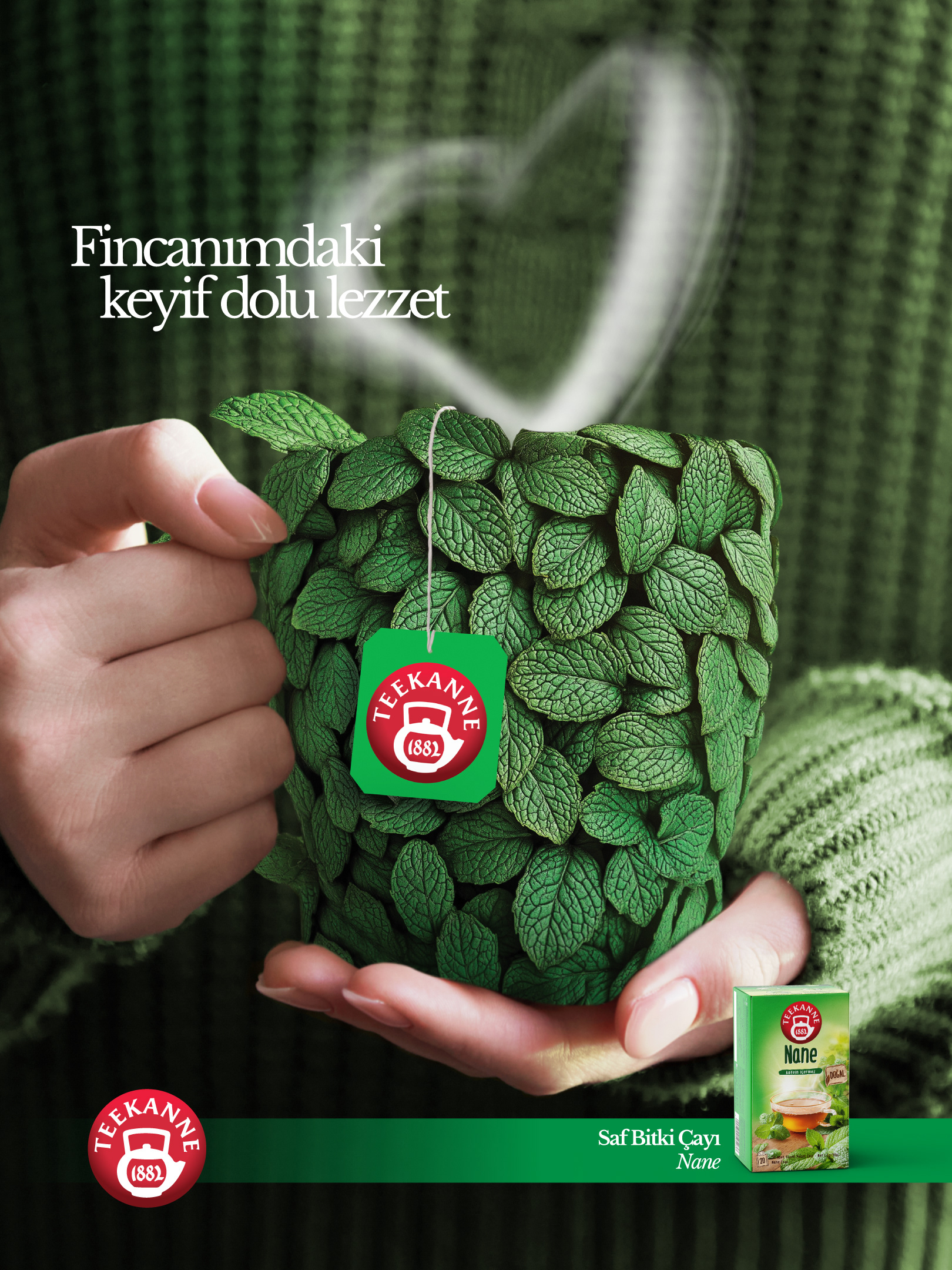
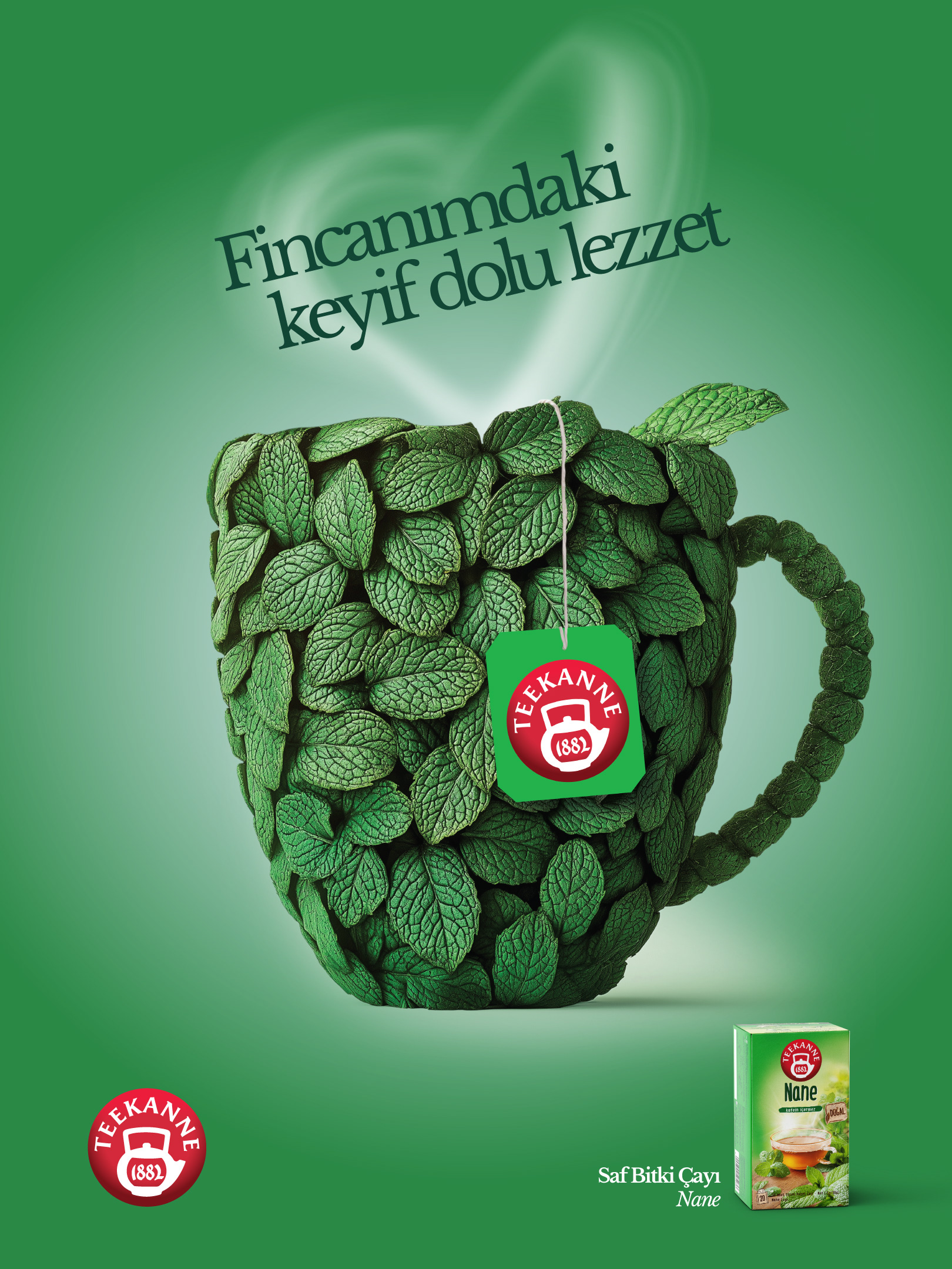
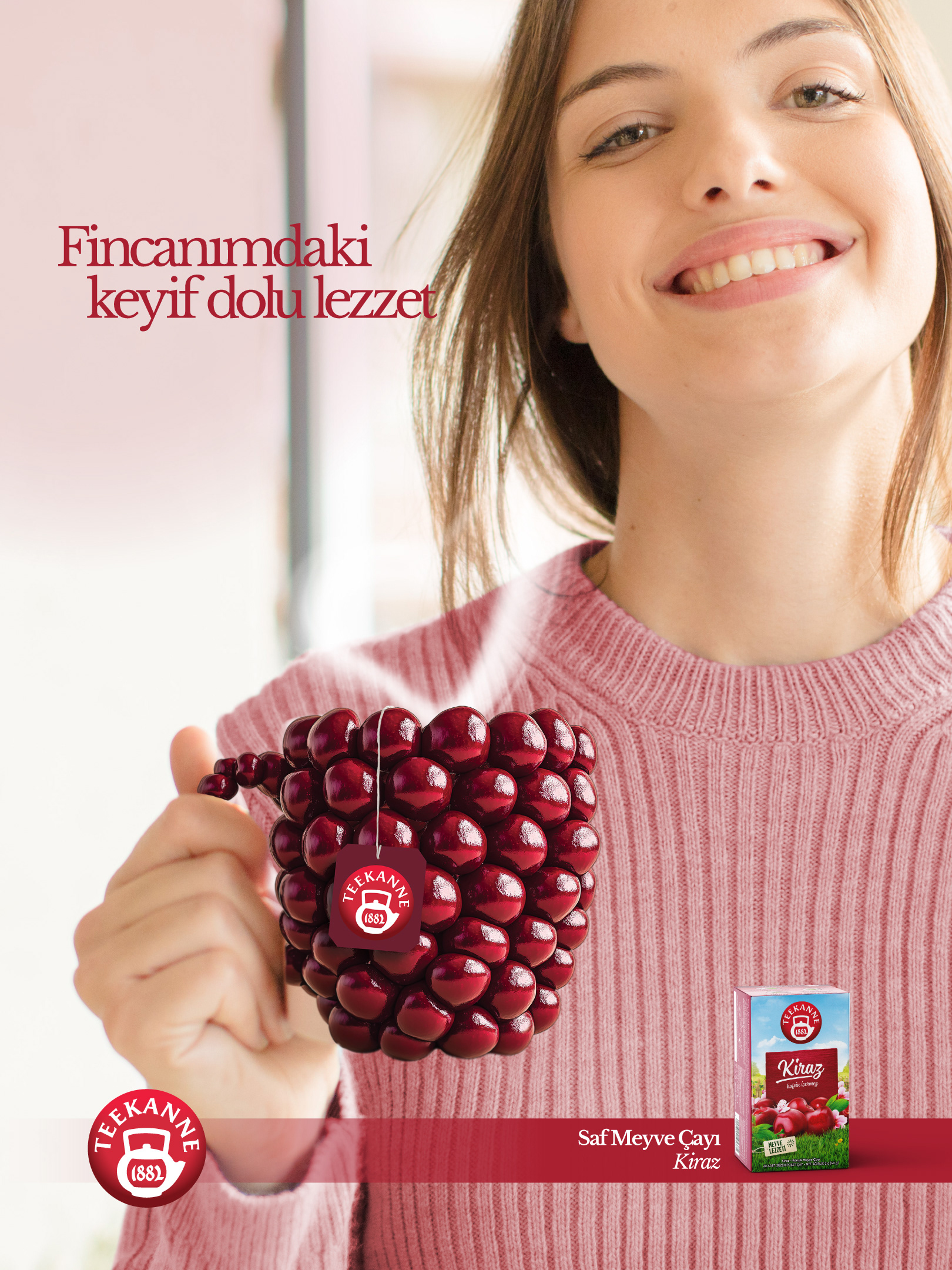
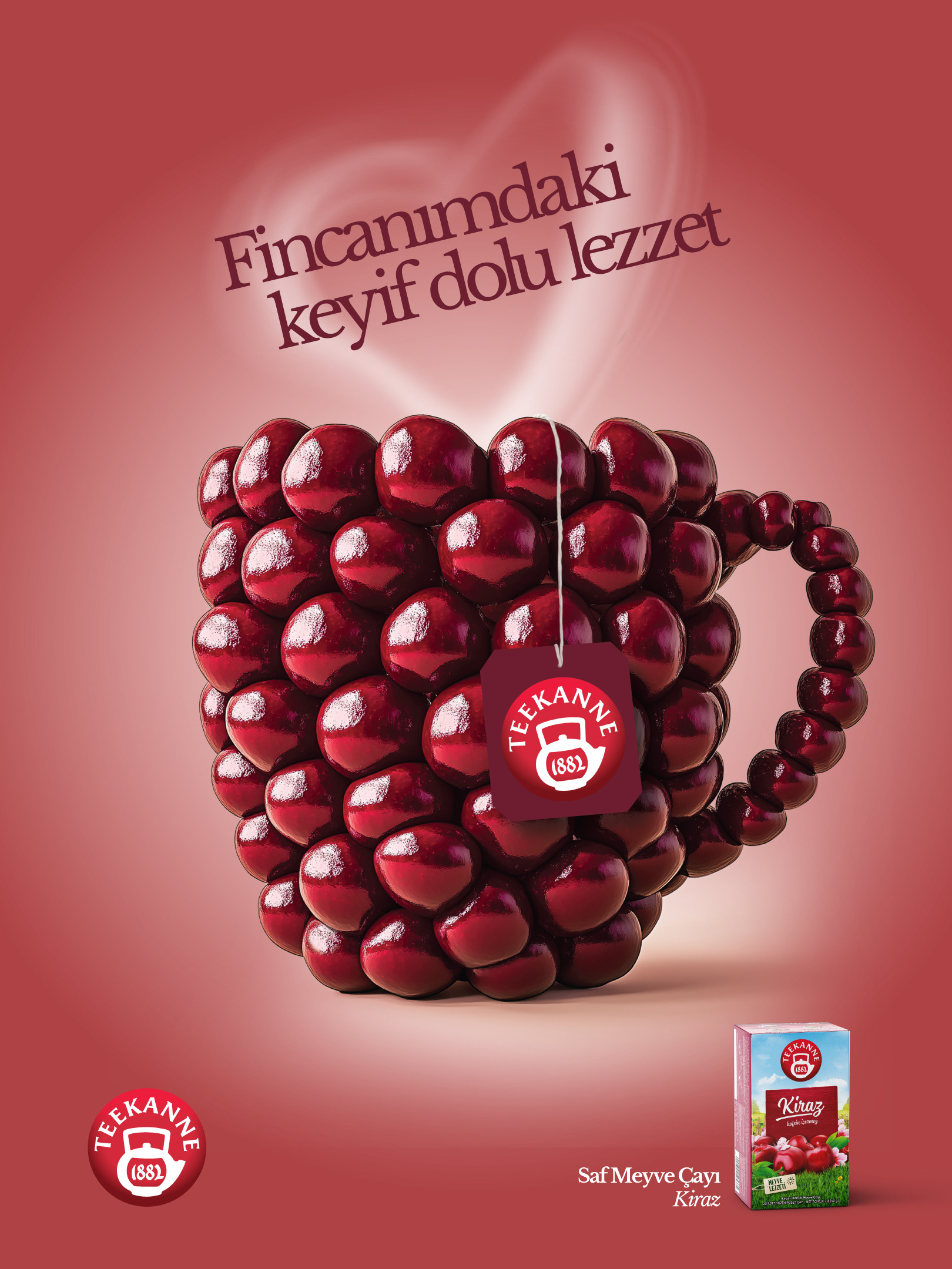
While Teekanne’s brand identity in Europe is built on “trust, credibility and natural quality,” in Turkey it was translated into a warmer and more personal language of “sincerity, joy, and flavor.” The most tangible outcome of this approach was the slogan “Fincanimdaki keyif dolu lezzet” (My cup of tasty joy), which was approved by the Teekanne team.
This strategy was not limited to a slogan; design concepts were also localized as an extension of this brand language. Colors, visual compositions, and product communication elements were restructured to deliver both the assurance of an international brand and the warmth of a familiar, local touch.
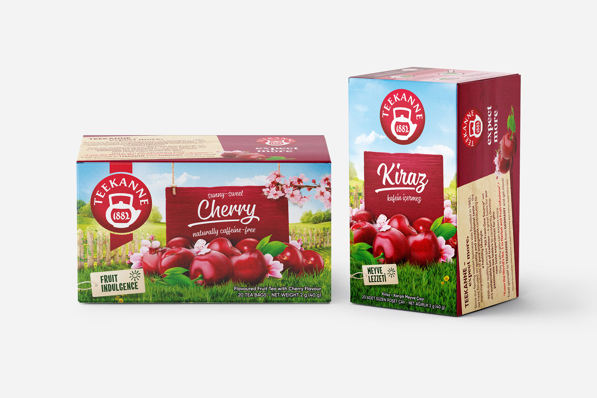
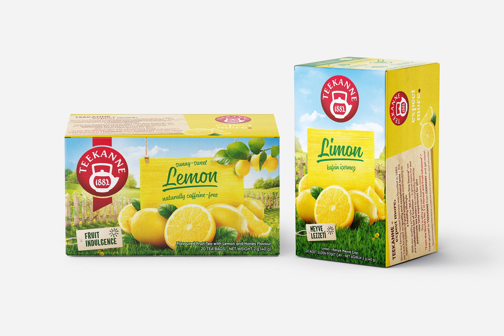
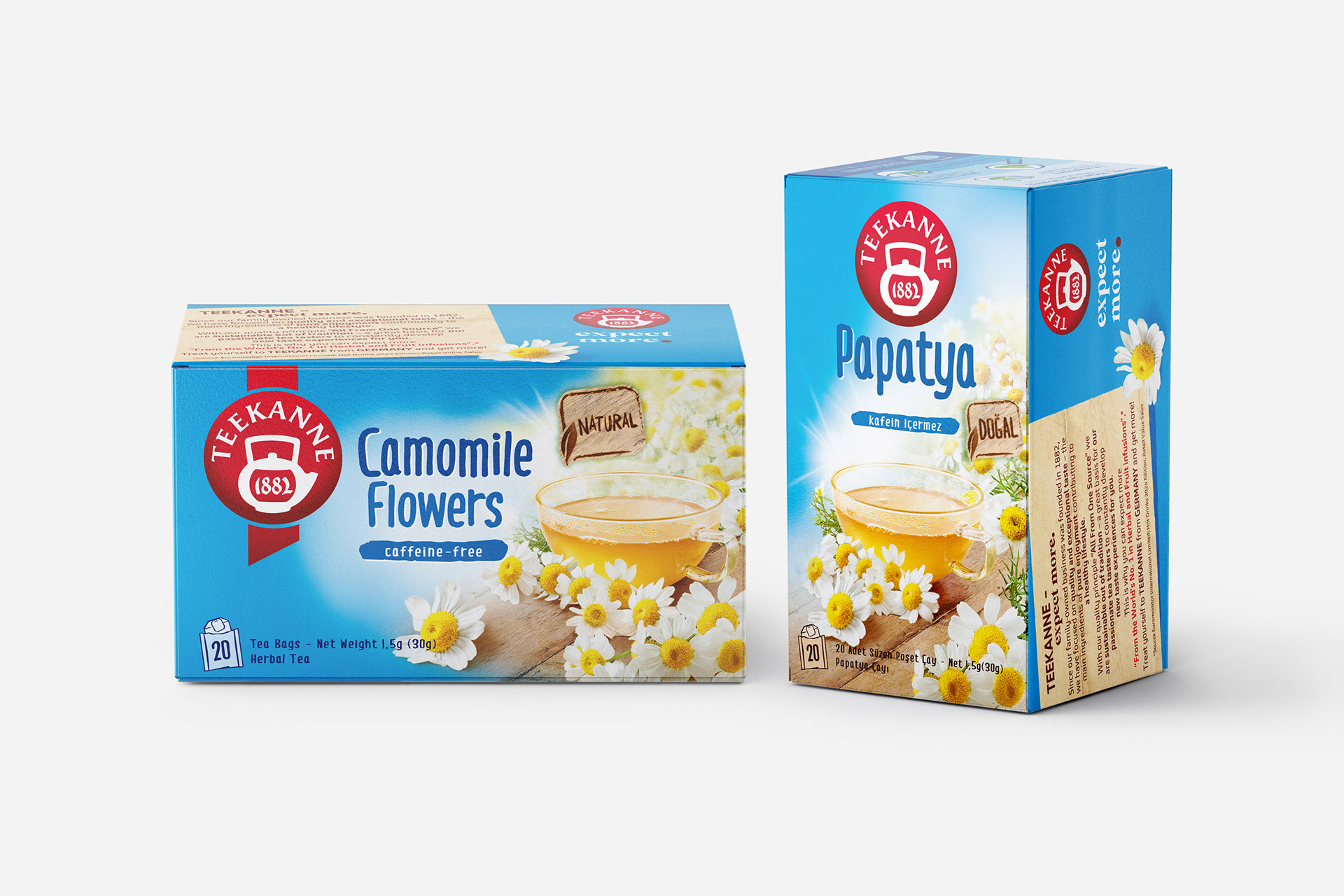
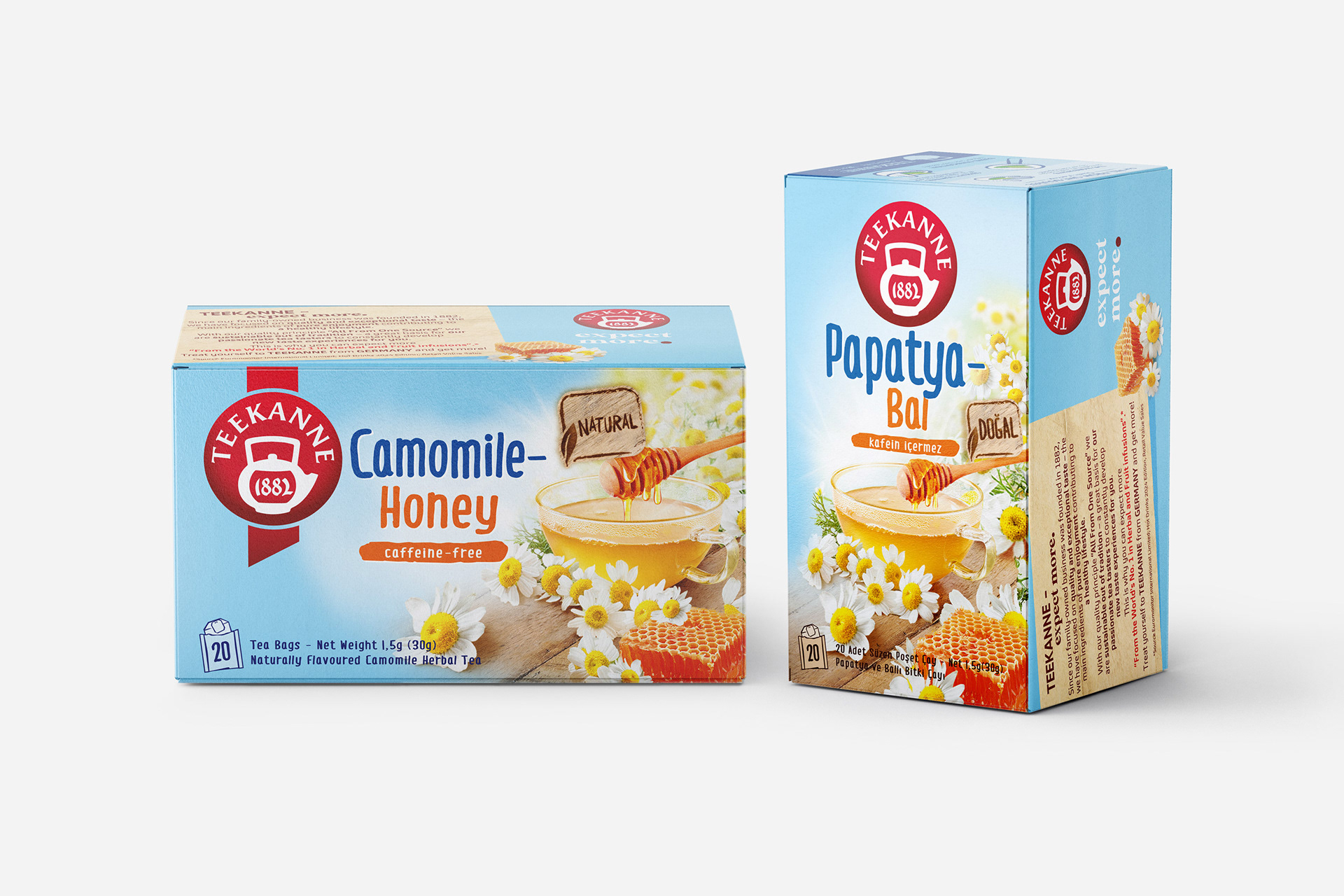
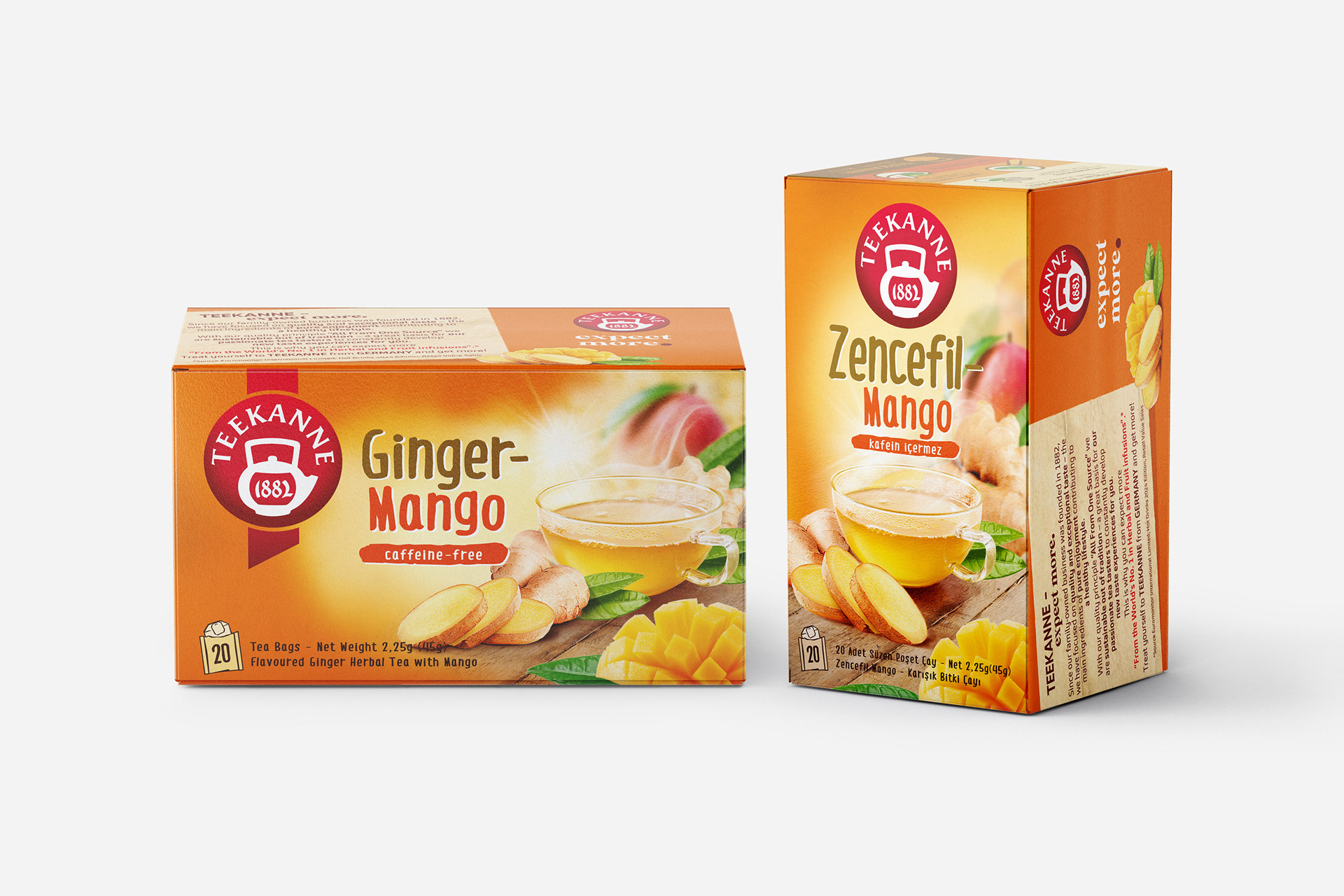
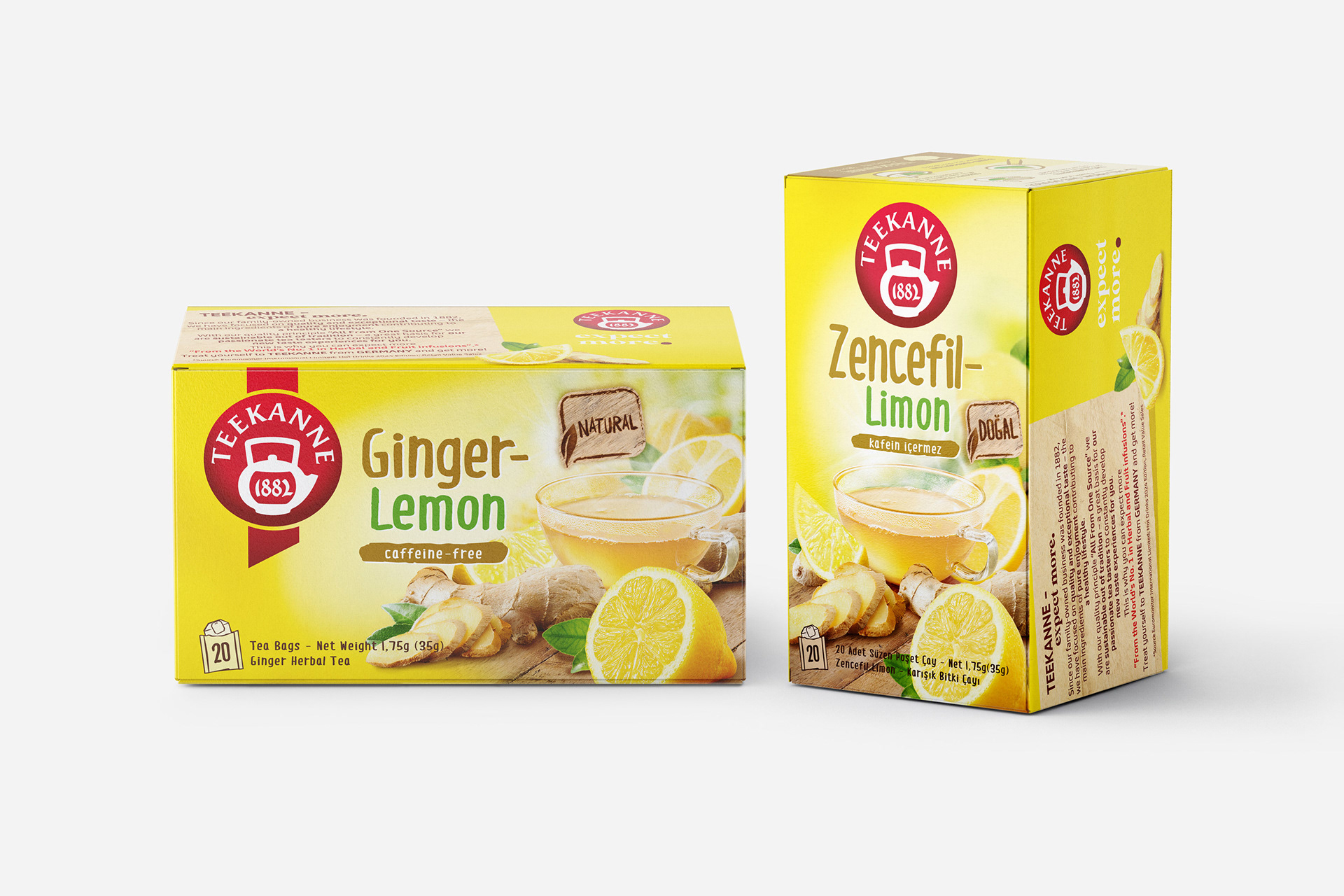
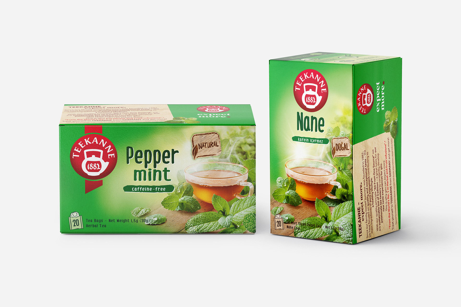
Packaging Design
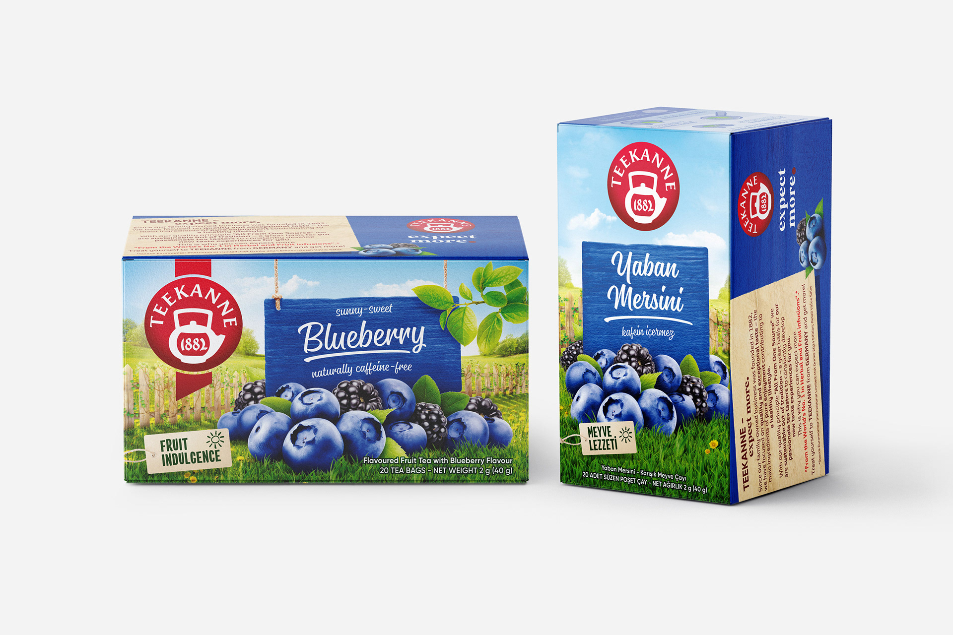
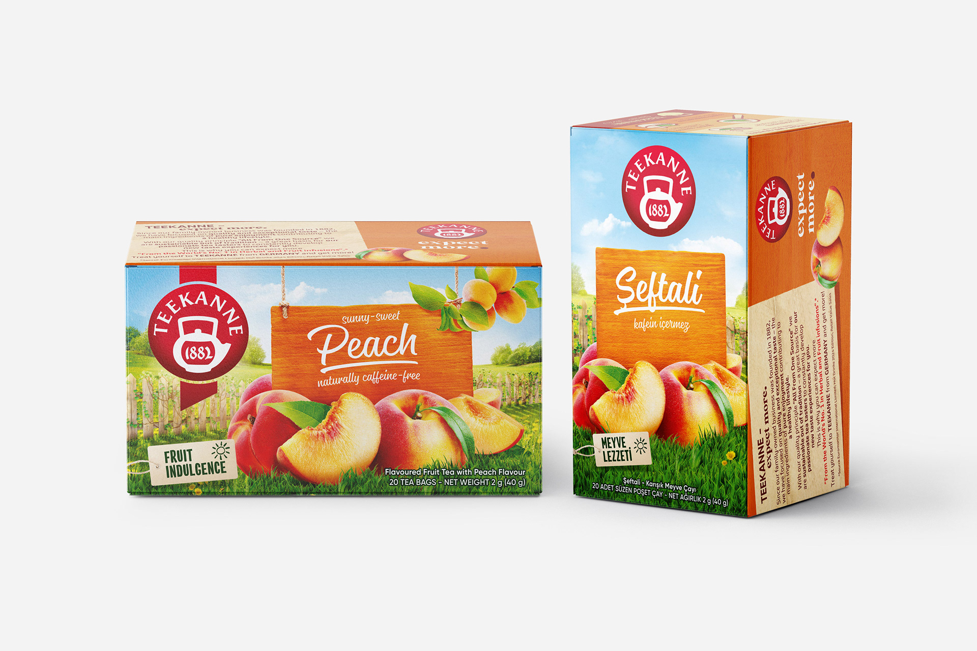
The packaging consisted of three main components: the consumer box, tea envelopes, and tags. Each required a different production and material approach. Both offset and flexo printing techniques were applied throughout the process. Offset printing ensured high detail and color accuracy on the consumer boxes, while flexo printing enabled flexibility and color consistency for the envelopes and tags.
The original design files from abroad were delivered in RGB format, but were converted into CMYK + Pantone systems to be suitable for local printing. Taking into account the differences in paper and PE materials and how each absorbed ink, new color profiles were developed. Color consistency was carefully monitored at every stage, with separate proof prints taken for each product.
As a result, color accuracy and consistency were successfully achieved across all packaging components. Eventually, Teekanne products appeared fully aligned with the global brand identity, maintaining a high-quality standard and a unified visual presence.
---------
Services
Concept Development, Advertising, Graphic Design, Packaging Design, Packaging Print Consulting
Creative direction, strategy-driven design and packaging by Cihan Camlica
Strategy and copywriting by Begum Yetiser
Date: 2025 | Client: Teekanne | Sales Partner: Fersan
For more information, visit instagram.com/teekanne_turkey